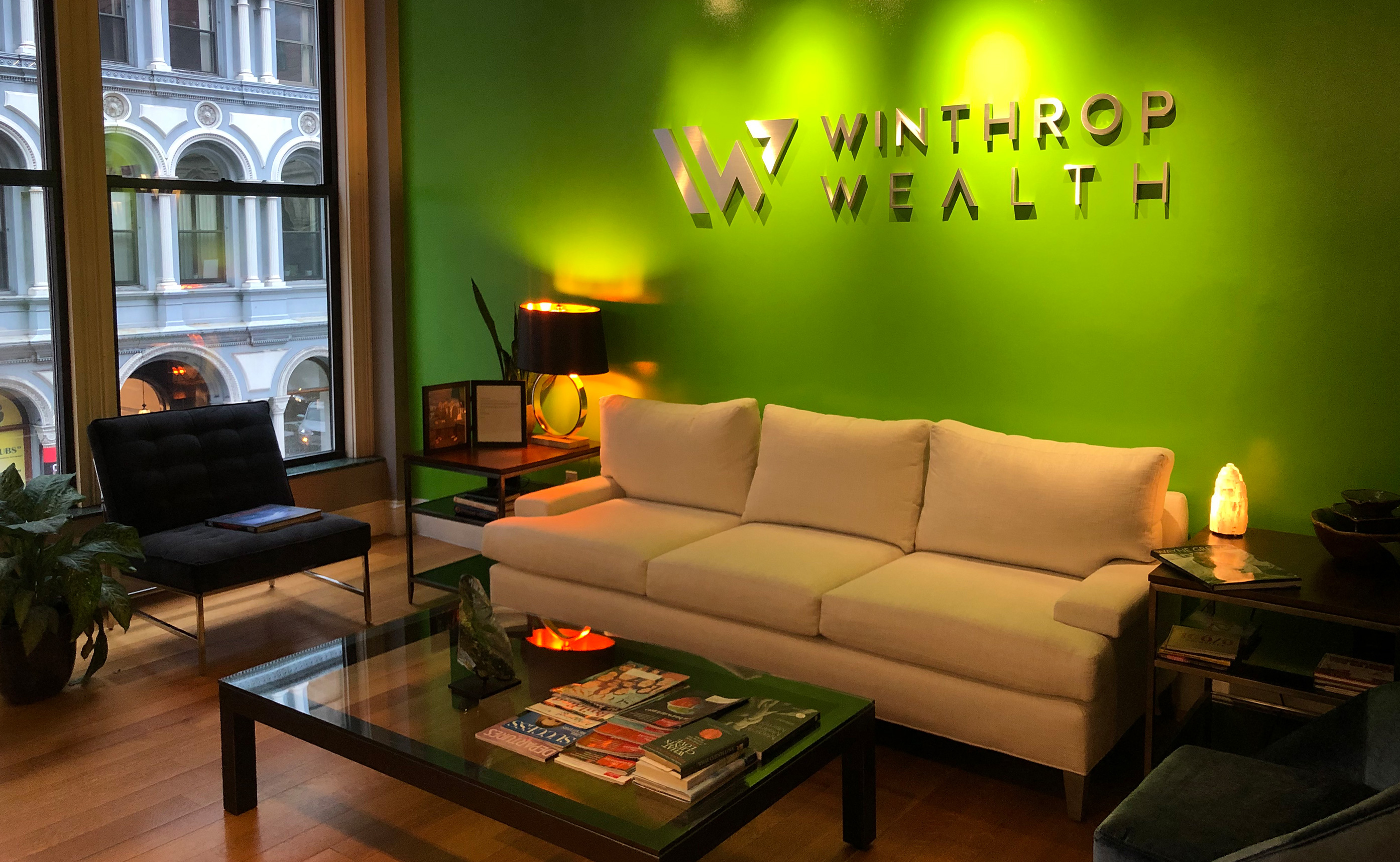
Winthrop Wealth
Rebrand for Winthrop Wealth, a senior wealth management advisory firm headquartered in Boston, MA. Our team was brought in to analyse their former branding, research stakeholders, dissect the company culture and communicate their values through a brand refresh. Our design guidelines for this identity were to be sleek, clean and uncomplicated, to boldly communicate solidity, support and growth, and to visually highlight the Winthrop legacy. “We’re Winthrop Wealth. We’re with you. For life”.
Winthrop Wealth maintains close and long-lasting relationships with their clients, ensuring their financial stability
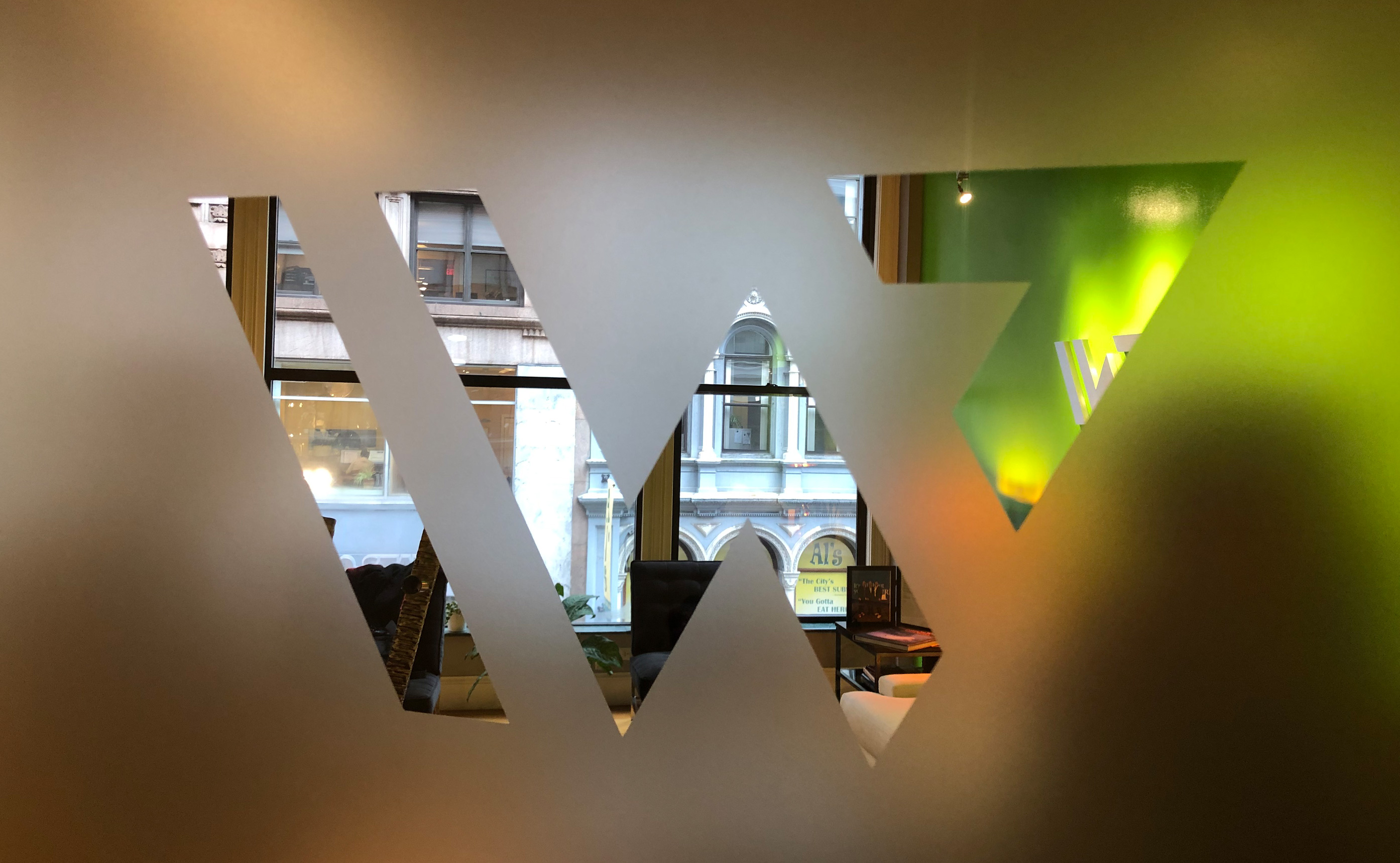
through the peaks and valleys of life. Symbolizing this narrative, we used a mountain as a metaphor to reflect trust, stability and grit, true to the Winthrop name.
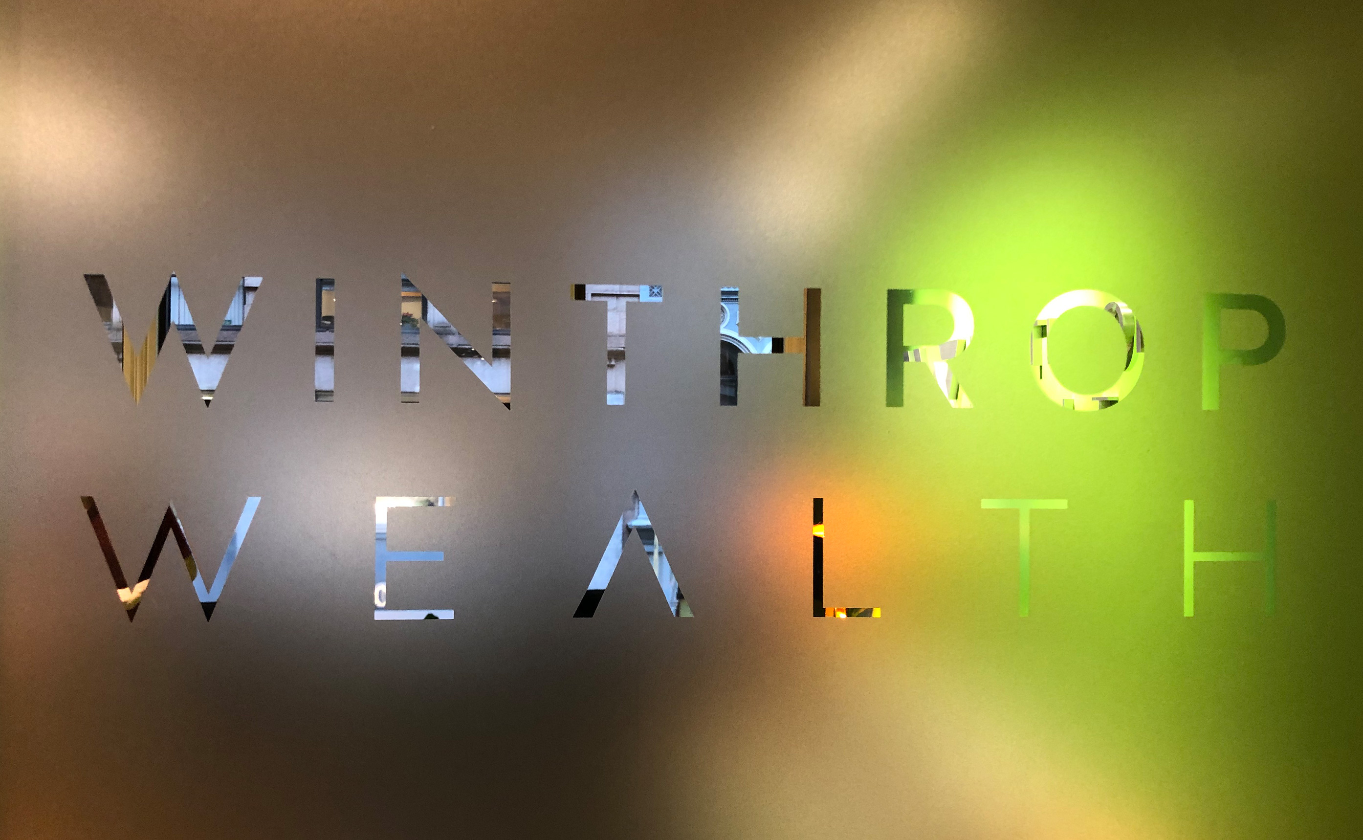
A slanting line to the left suggests another W, and the arrow motif speaks to growth and a future-forward attitude. Bright green evokes warmth, trust, and good financial health.
kor group ltd.
Creative Direction: Karen Dendy-Smith | Art Direction + Design: Vaishnavi Kumar, Doug Rickert | Messaging: 43,000 Feet